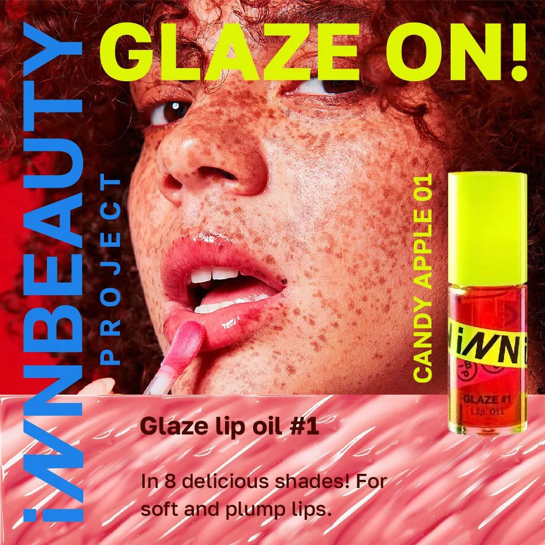
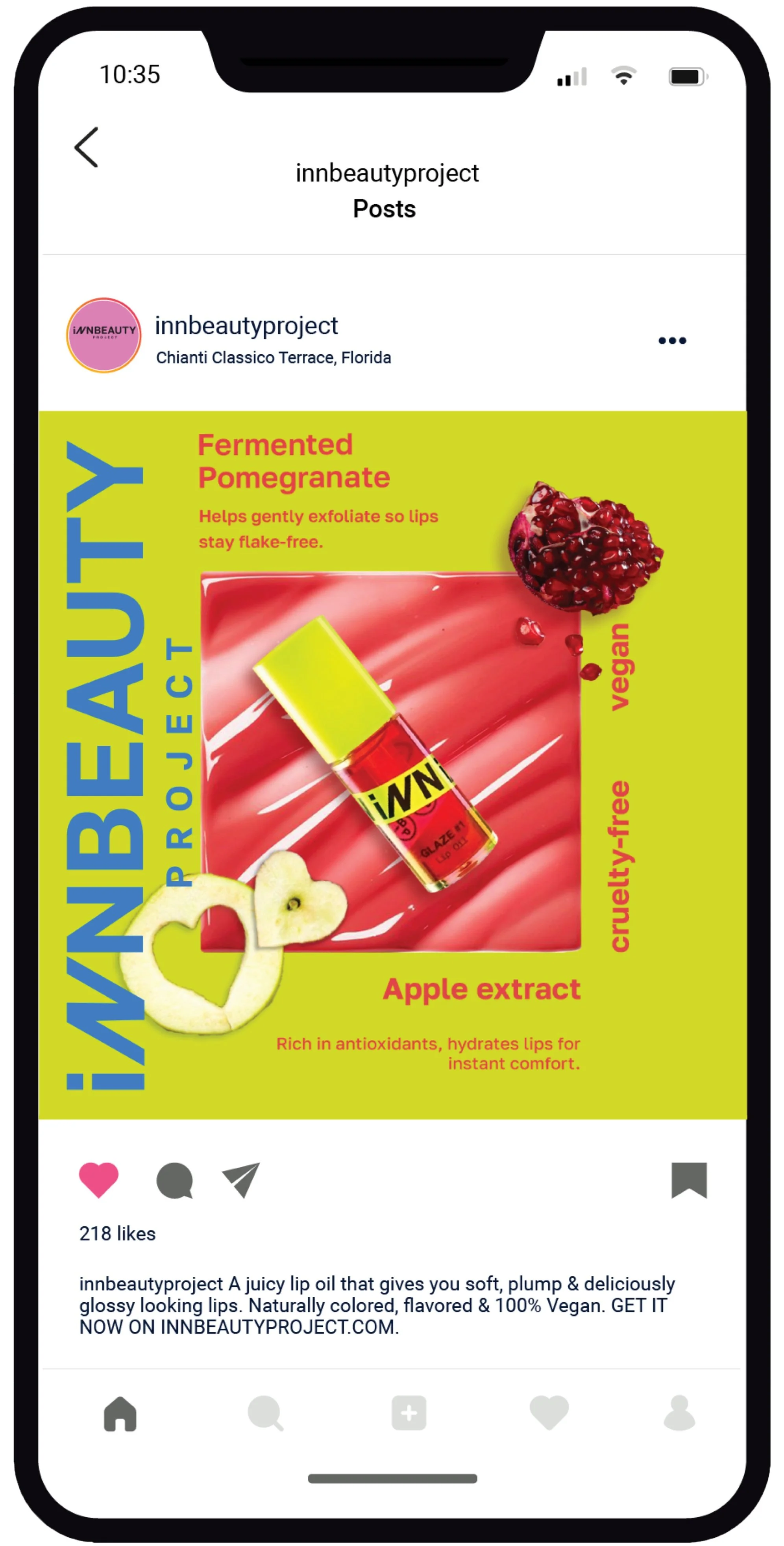
Description: I created three unique photographic media designs for Innbeauty Project, a renowned cosmetic brand. The primary objective of this project was to design advertisements that would complement the overall branding of Innbeauty Project. To achieve this, I carefully crafted the layout and design of the advertisements based on their existing branding elements, specifically their maximalist and vibrant color palette.
THE CONCEPTS:
MAXIMASLIST
ULTA-CORE
GIRLIE-POP
VIBRANT

Olive Green
#BFBB7E
Moon Dust
#D9D3CC
Charcoal
#221E1F

Second Social Media Slides
Client: Student Project


Social Media Slides
Client: Student Project
Denim
#3B6D8C
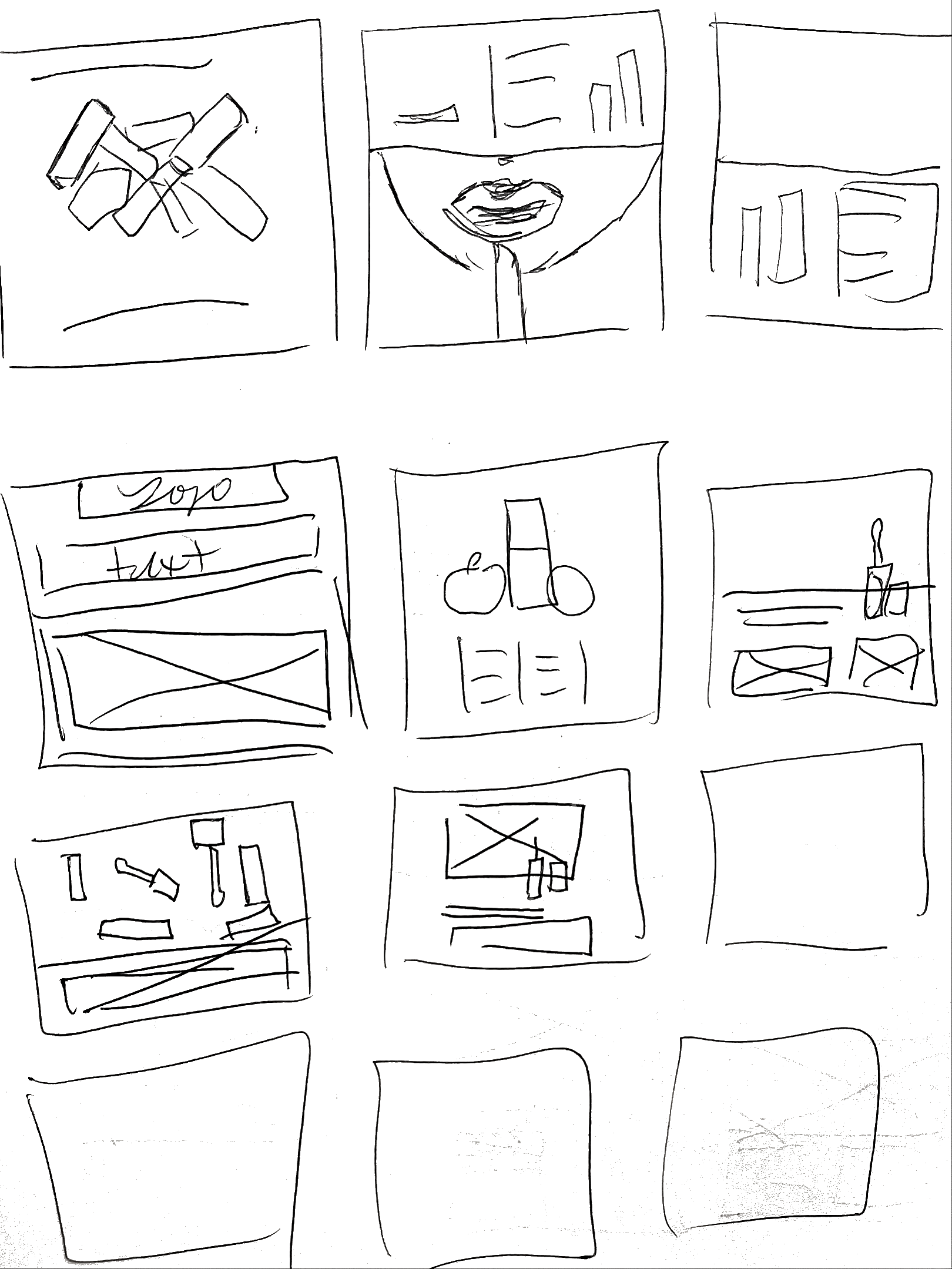
CHALLENGE: Create a set of three social media slides based on product of our choosing. Then create another with the opposite concepts.
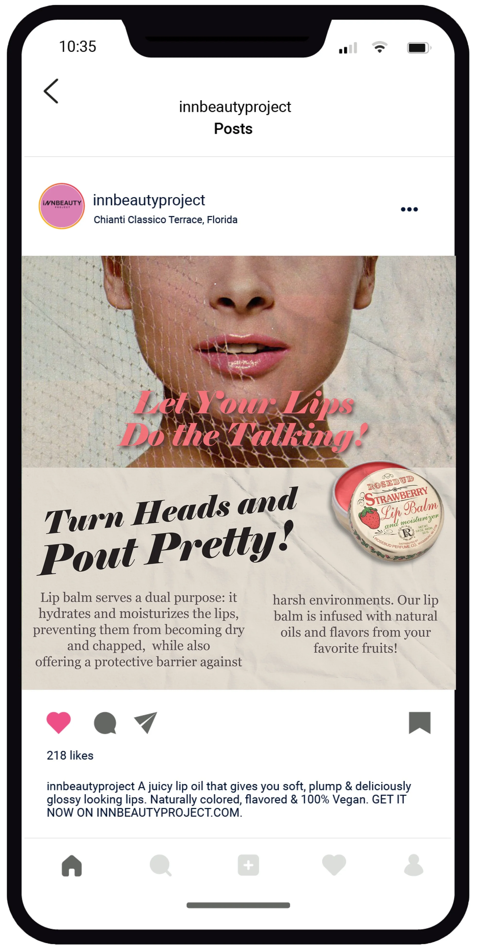
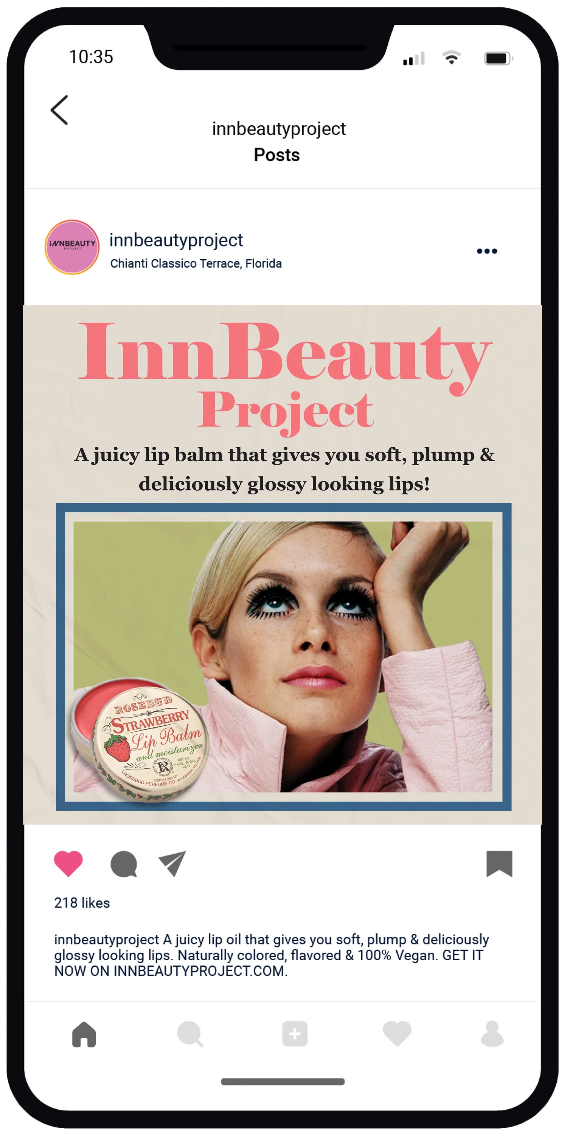
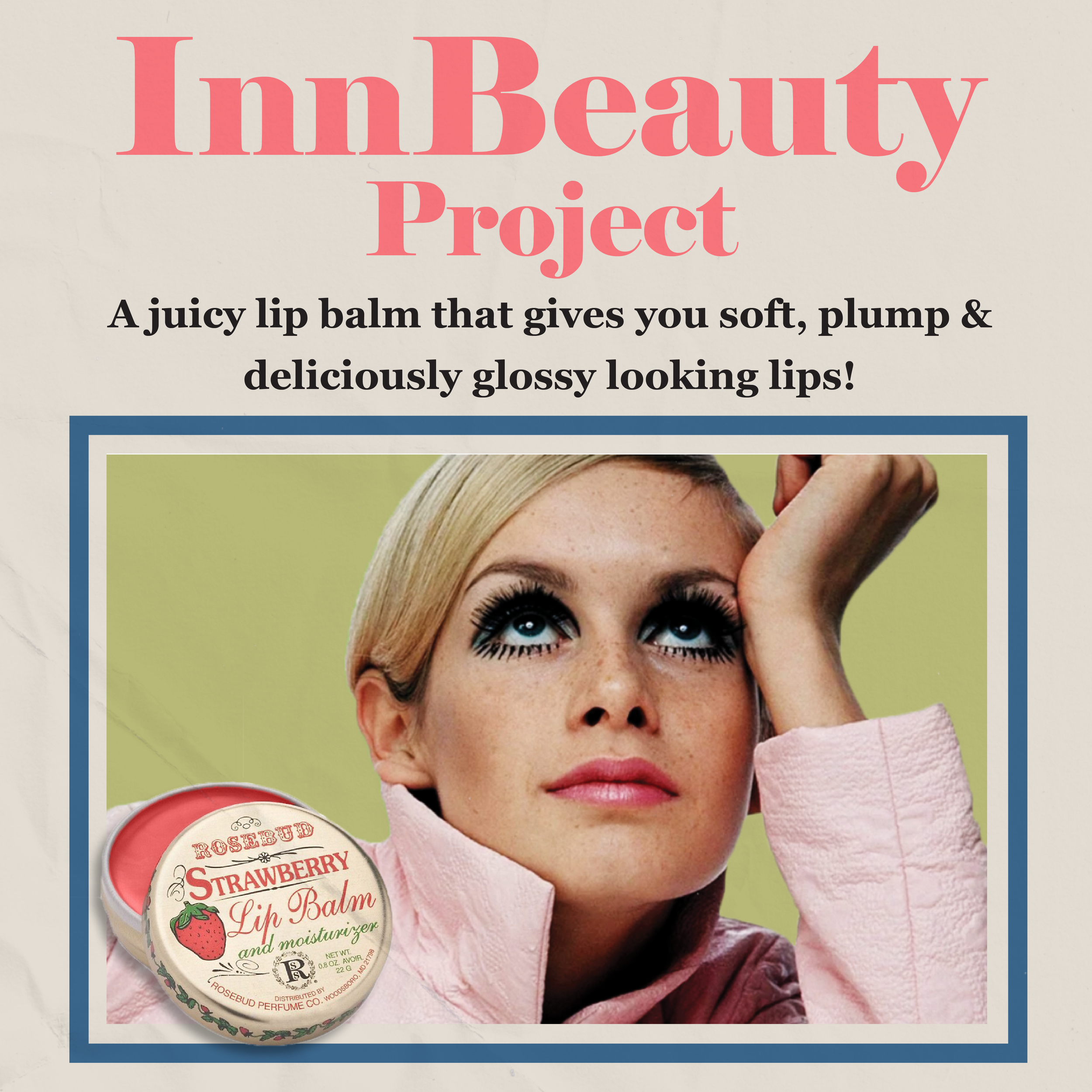
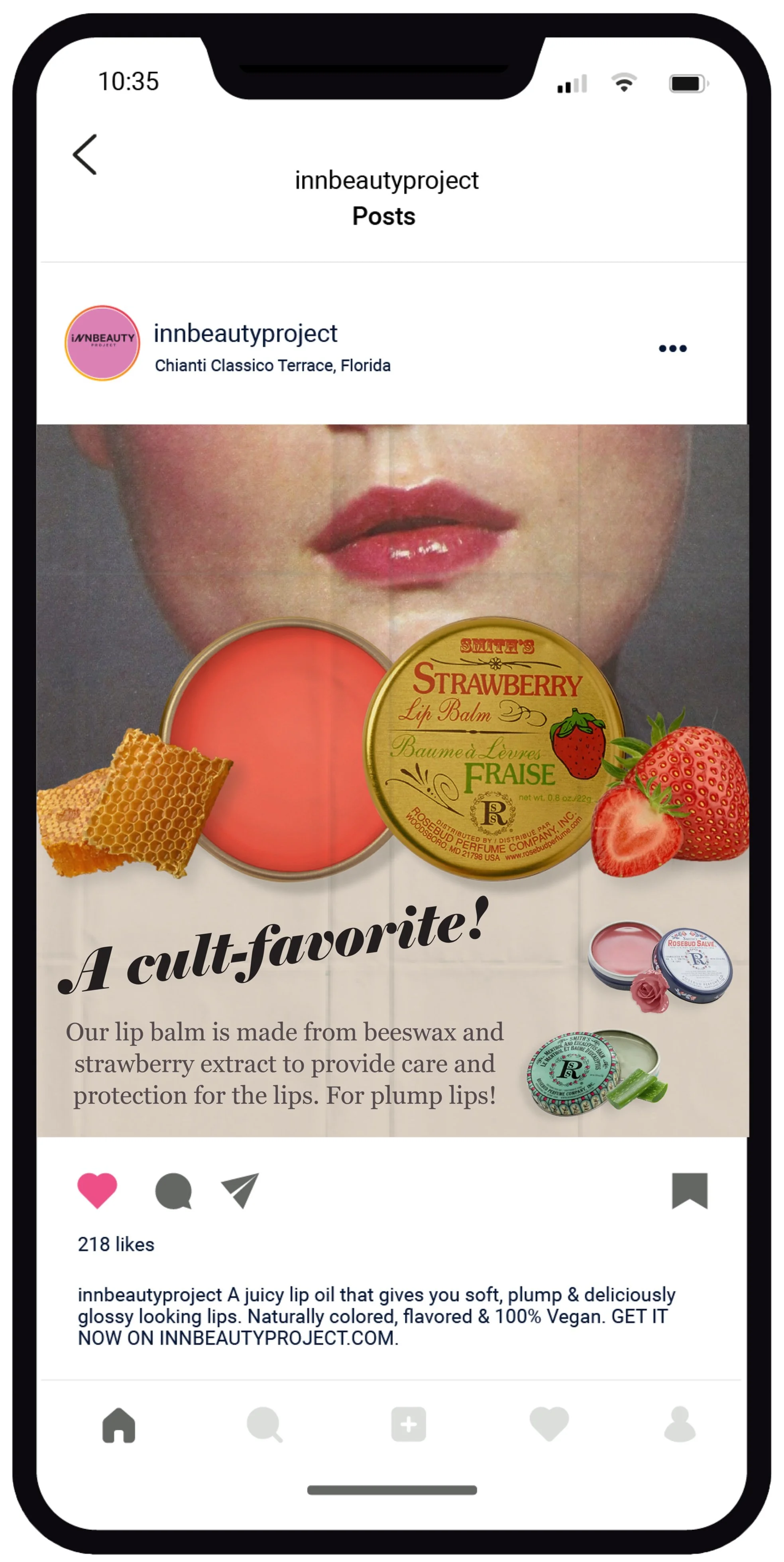
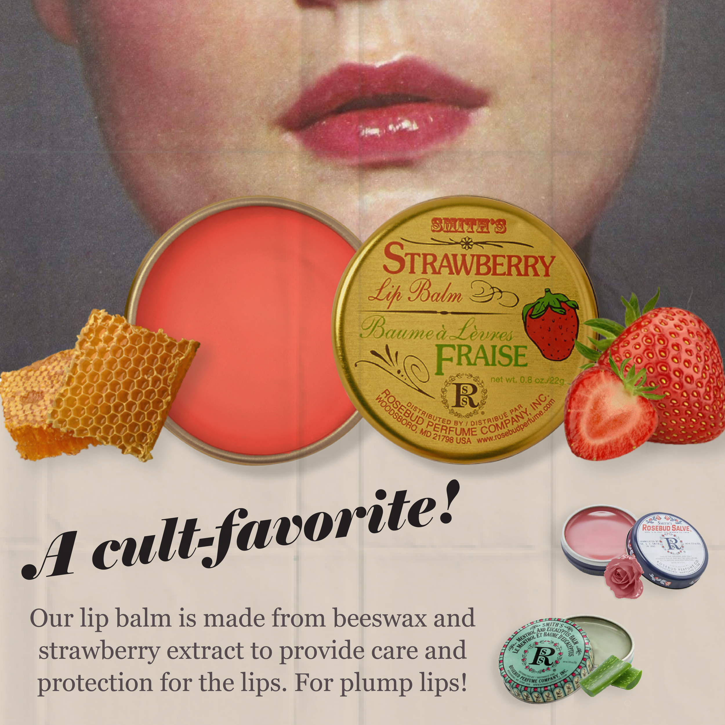
Description: The second series of ads draws inspiration from the design trends of the 1960s and 1970s, incorporating elements like human faces to highlight the product being advertised. The typography used in these ads is playful and fluid, deviating from the clean and minimalist look of modern typography to create more expressive and artistic forms that capture the viewer's attention.

FONT CHOICE

THE CONCEPTS:
MUTED
ZINE
SEARS
RURAL
Watermelon Pink
#2291F2


CHALLENGE: Create a set of three social media slides based on product of our choosing. Then create another with the opposite concepts.
Rossa Cora
#E70204
Rosy Pink
#F26BC3
The inspiration behind the color scheme is drawn from the vivid and lively colors utilized in InnBeauty Project's branding. These colors are well-known for their ability to evoke a feeling of hopefulness, enhance the natural beauty, and create an overall sense of vibrancy.

Sulphur Spring
#EAF207
Deep Brown
#400601
Blue Dress
#2291F2