THE COLOR PALETTE

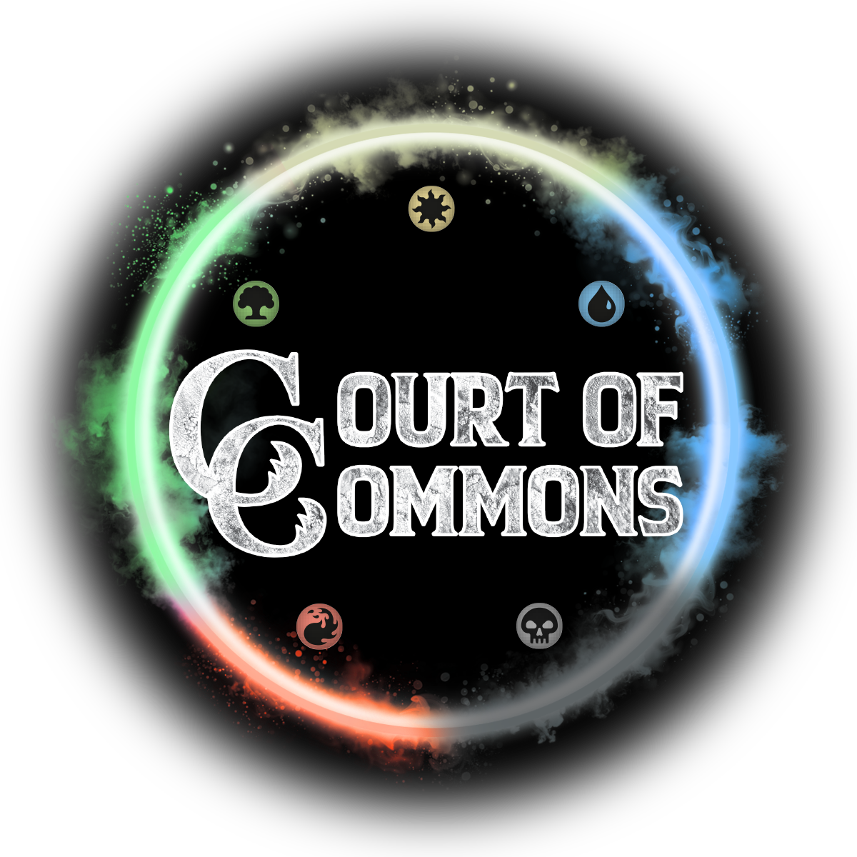
For the color palette, I wanted to focus on all five Magic: The Gathering colors white, blue, black, red, and green in the Pauper logo strengthens the format’s identity by representing the full range of playstyles and philosophies. It shows that Pauper supports every color combination, welcoming all types of players and strategies without favoritism. This design choice also keeps the format visually tied to the broader MTG universe, making it instantly recognizable to both new and longtime players. By reflecting the diversity of gameplay and staying true to Magic’s core identity, the five-color logo reinforces Pauper’s place as an accessible, legitimate, and inclusive format.

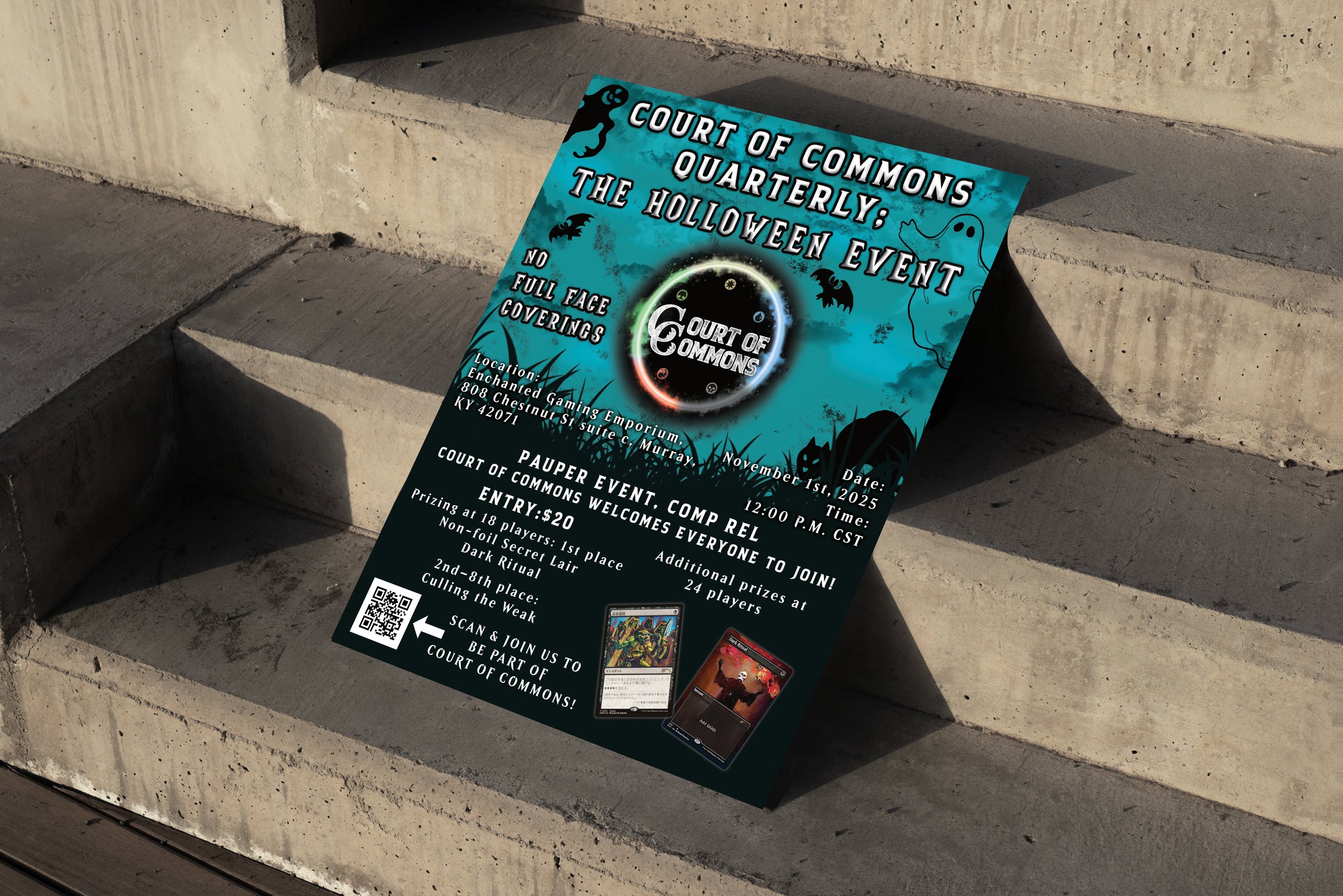
Court of Commons: MTG Pauper Logo

Client: Local Pauper group

Challenge: To create and design a logo for a local Magic: The Gathering Pauper team based in Murray, KY, with the goal of making it easily recognizable and appealing to both longtime players and newcomers to the game.

Air Blue

#70A9CD

Firecracker

#EA644A

Summer Green

#7BD38C

Lemon Grass

#DDCED8F

Wild Dove

#8b8b8b


THE NAME

When brainstorming a name for our Pauper Magic: The Gathering group, we explored a variety of options that reflected both the format’s identity and its communal spirit names like Common Grounds and Cult of Commons were early favorites for their clever nods to card types and shared enthusiasm. However, we ultimately chose Court of Commons for its evocative blend of nobility and accessibility, capturing the idea of a regal assembly built from humble pieces. The name felt both fitting and playful a subtle contradiction that echoed the heart of Pauper itself. In designing the logo, we played with textures and color schemes reminiscent of the original MTG branding, aiming to invoke a sense of familiarity while establishing our own unique identity.

THE FONT CHOICE

I chose the font Backcountry for the logo because it immediately sets a tone of rugged charm. Its bold, vintage inspired letterforms give the design a textured weight that fits naturally with the fantasy theme I’m aiming for. I love how the subtle roughness in the edges and the strong presence of each character create a tactile feel, almost as if the text were carved into stone or stamped in an ancient grimoire. With its serif like qualities and textured style, Backcountry helps me convey a sense of history and storytelling—much like the immersive typography seen in Magic: The Gathering while still staying bold and highly legible.

Description: This project involves the creation of a custom logo for a community group dedicated to Magic: The Gathering Pauper format. The goal was to design a visually compelling and meaningful logo that reflects the unique identity of the Pauper format—a version of Magic: The Gathering that emphasizes creativity, accessibility, and strategic gameplay using only common cards.

The design needed to resonate with both seasoned players and newcomers, conveying the spirit of community, fair play, and the grassroots nature of Pauper. It also had to be versatile for use across social media, digital platforms, merchandise, and event branding.

Next
Next

Four Seasons Service & Sales